Houston, We Have a Rebrand: Elevating the Rockets' Identity
How a Cosmic Rebrand Could Launch the Houston Rockets into the Future
Crafting a visual identity of an NBA team is an undertaking that takes hundreds of employees, thousands of hours, and millions of dollars. I did it for every NBA team in eight months. What guided me was decades of team cultures and identities. As well as my creative vision for what the future of the NBA could look like. The result was my idealized version of the NBA brand. One with 32 teams, a Jazz team in New Orleans, and an All-Star Weekend that feels unique.
For this article, I'll look at one team, the Houston Rockets. As a franchise on the rise, the Rockets could benefit from a refreshed identity. Their current branding has remained largely unchanged since the James Harden era. However, this current iteration of the team is unrecognizable from that time. With Alperen Şengün, Jalen Green, and Amen Thompson taking over the reins, I decided to push the Rockets' identity to new heights.
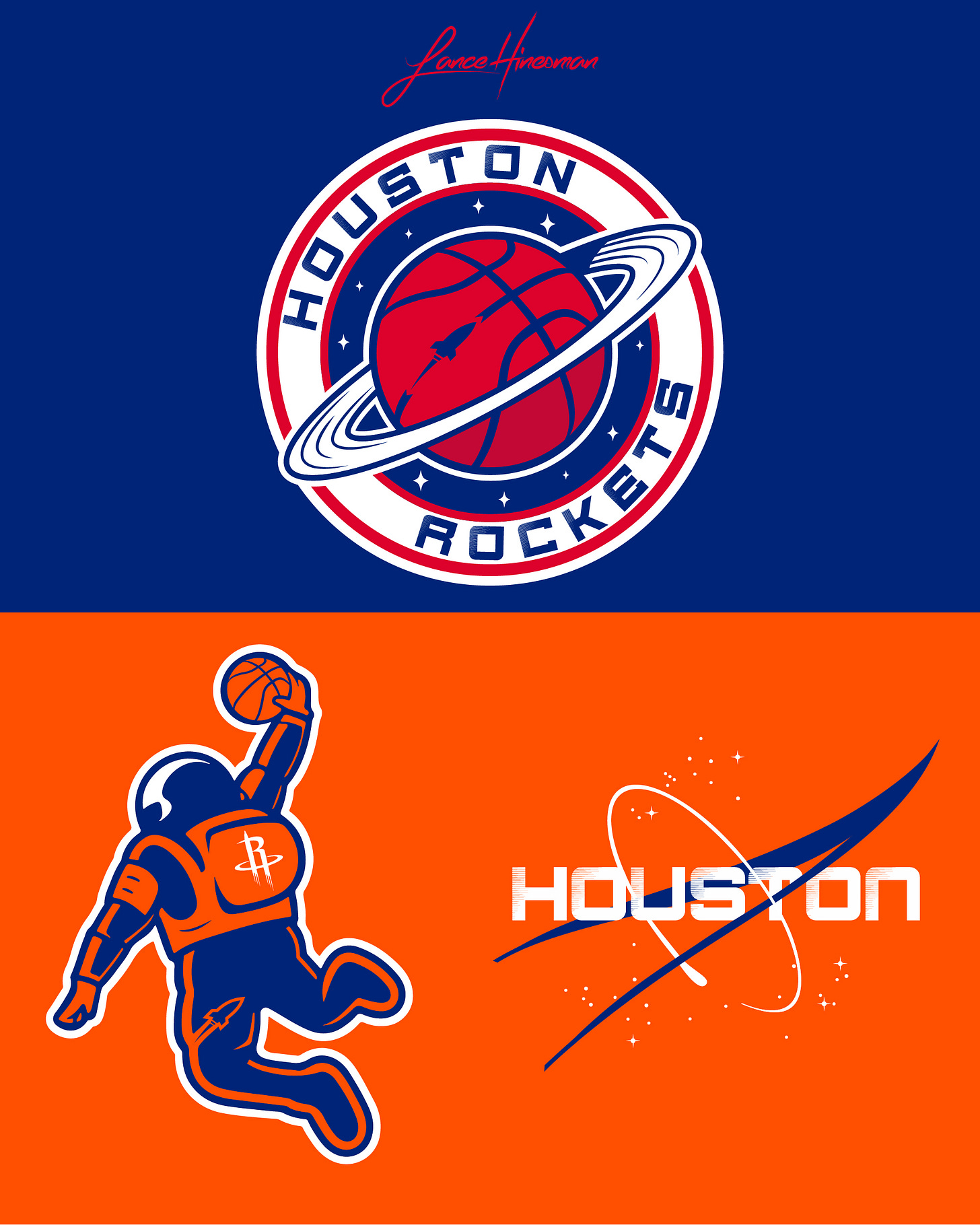
My first order of business was to add a splash of color to the brand, replacing the black with a navy blue. Throughout the redesign, I changed the colors of the Pistons, Clippers, and Wizards, paving the way for a new red, white, and blue team. Because of the sustained use of the Rockets' main logo throughout the 21st century, I didn't want to do away with it completely. I instead used it as a secondary logo present throughout the redesign. The vision for the main logo was to create a more crest-like design. I wanted the logo to feel as if it would fit stitched onto a real space suit, or that it represents a real intergalactic organization. The bottom two logos were for the "City" Jersey, one refreshing the "Dunkstronaut" from the 2023-24 Rockets' City Jersey, and the other playing on Nasa's famous logo.
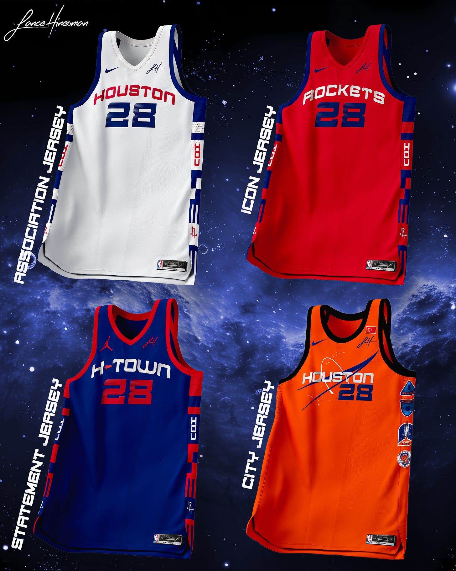
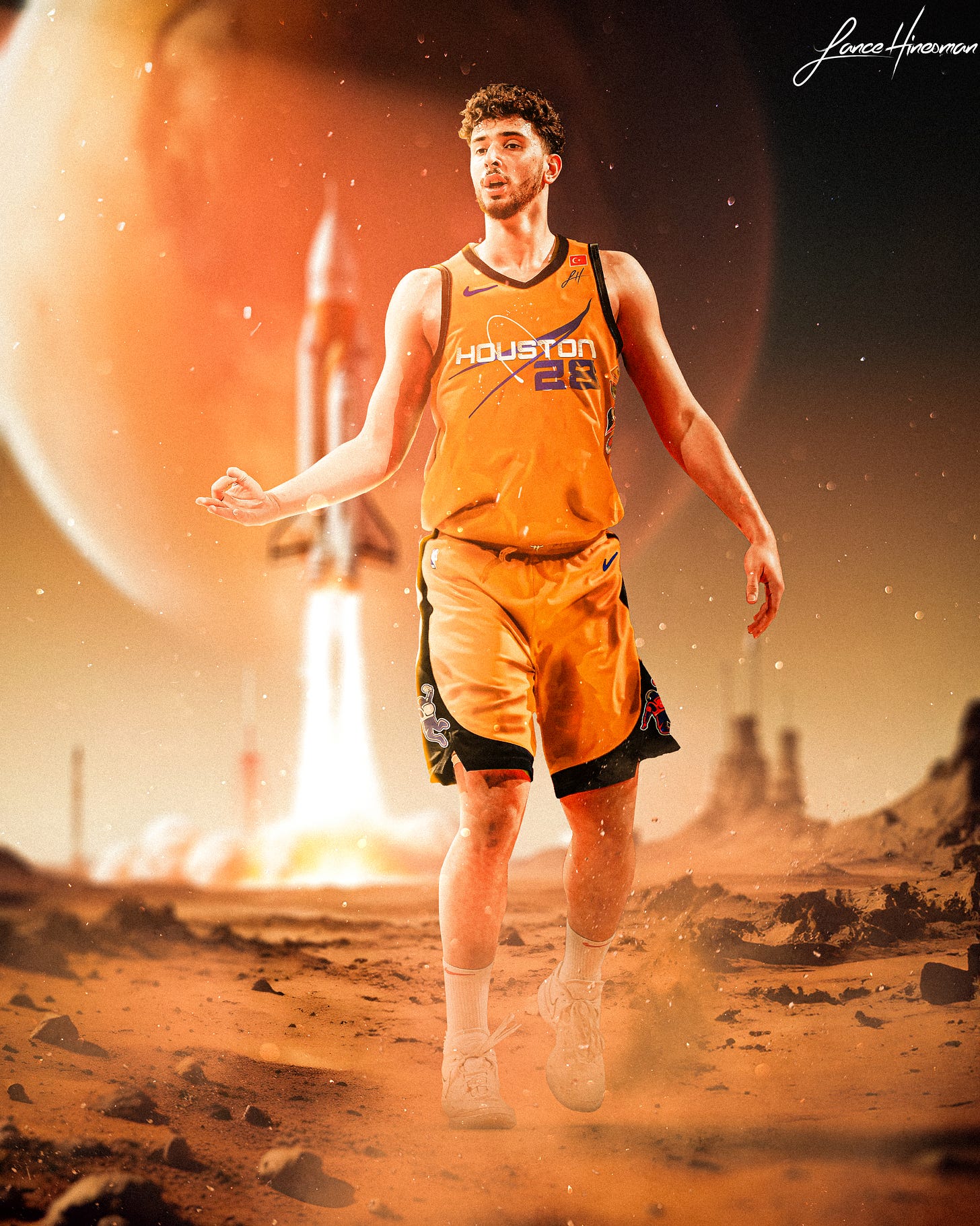
Leaning further into the cosmic agency idea, I looked to NASA's spacesuits and rockets for inspiration. The Association, Icon, and Statement Jerseys feature side paneling inspired by the Apollo 13 rocket. The City Jersey is more directly influenced by Nasa's orange space suits, fit with side patches, and a flag with the player's country of birth.
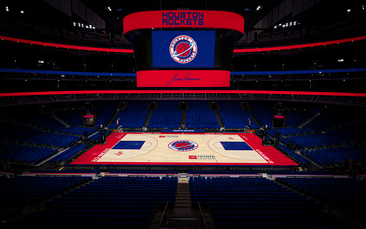
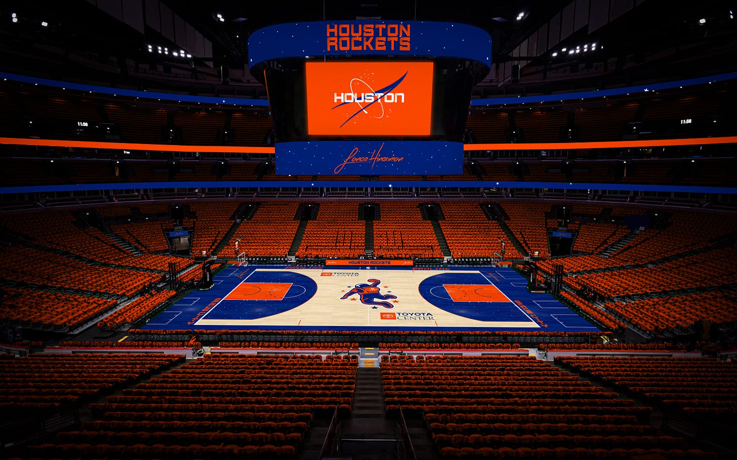
The redesigned main court is rather standard, featuring the new main logo at center court and the previous main logo at the sides. The city court has a lot more visual intrigue. Sporting the Dunkstronaut at center court and a star-filled 3-point line. This court was designed to be more interesting than your average court, but not veer into In-Season Tournament court territory.
To wrap up, I have an artwork of Şengün on a rocky planet. A space shuttle takes off behind him, and we get a clear look at the City Jersey. Overall, the Rockets' redesign ended up being one of my favorites. I stayed true to my goals of successfully elevating the brand, without ditching what's become iconic in Houston already. By blending the Rockets' storied past with a futuristic vision, the redesign not only honors Houston's legacy but propels the franchise into a new era of cosmic greatness.
The rest of the redesign can viewed here, along with the rest of my graphic design work.


This is sooooooooo sick!!!
Where’d you get the PSD of the floating jersey?? Or did you make it yourself?
I’m a rockets fan and I agree with you! I’ve been hoping they revamp their uniforms and logos for years! They’ve altered the uniforms some but for the most part they all look similar since the pin strip days!