


Driven by Design: Redefining the Detroit Pistons’ Brand
The Pistons’ best season in over half a decade earned Detroit fans a re-design
A couple of weeks ago, I looked at the Houston Rockets’ branding to explore how their visual identity could evolve as their team progresses. Today, I want to do the same for the Detroit Pistons amid a breakout stretch of games. The Pistons, on an 8-game win streak, seem to be rounding the corner and are firmly in possession of the 6th seed in the East. With MIP candidate Cade Cunningham manning the wheel, the future finally seems bright in Detroit. With this future on the horizon, I’ll share my vision for the Pistons’ brand. One that doesn’t reject their history, but builds upon it.
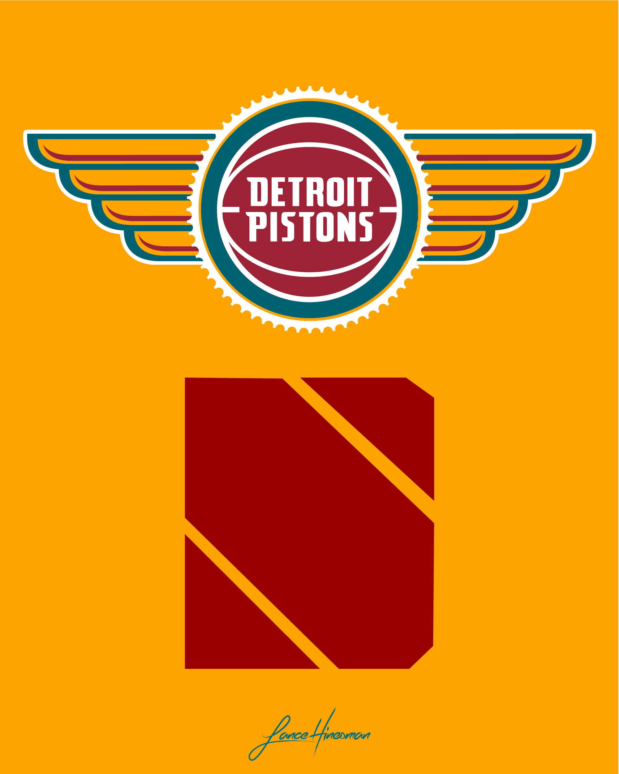
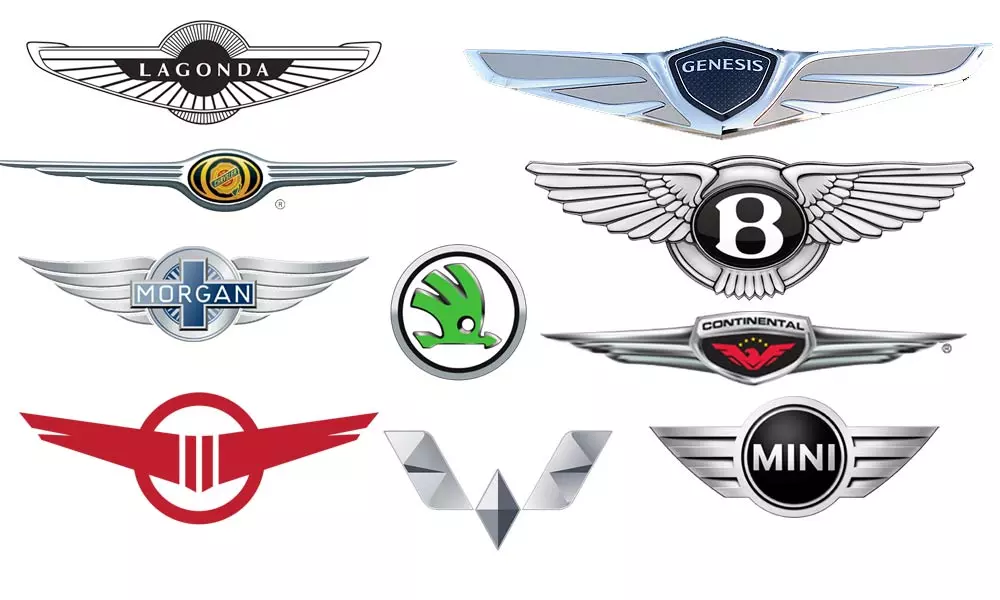
The Pistons’ logo and colors were some of my biggest priorities for the redesign. The current Pistons’ logo is rather plain; even though it pulls from history, the main logo could benefit from simple additions. I opted for a gear and wings—similar to those found on many automotive brands. The NBA has four teams (Pistons, Clippers, 76ers, and Wizards) that all share a red and blue color scheme. For the redesign, I shifted most of them away from that as I felt the color scheme was too common. Fortunately, the Pistons have a previous color scheme that I love and would be unique to them within the NBA. Bringing the teal back was a successful venture for the team when they revealed their classic uniforms in 2022. In a potential redesign, it was the obvious choice for me. The bottom logo ties into the “City” branding. Inspired by Motown and the music history of Detroit, I created a ‘D’ in the style of Motown’s famous ‘M’ logo.

I wanted the uniforms in this redesign to feel familiar. In my opinion, the Pistons already have great wordmarks and typefaces, and seeing them in the teal colors just feels right. In any real rebrand Detroit might undergo, I’d love for them to reintroduce the horse back into the branding. I decided to keep it out of here for two reasons:
Almost everyone to design a Pistons' jersey concept uses the horse
In order to make the wordmark and number stand out on the City Jersey, I chose to have a dark, funky pattern in the back with bright gradients on the type. With a city as storied as Detroit, I’m surprised a Motown jersey hasn’t been done sooner. But I’m happy I get to take a shot at it for this personal project.
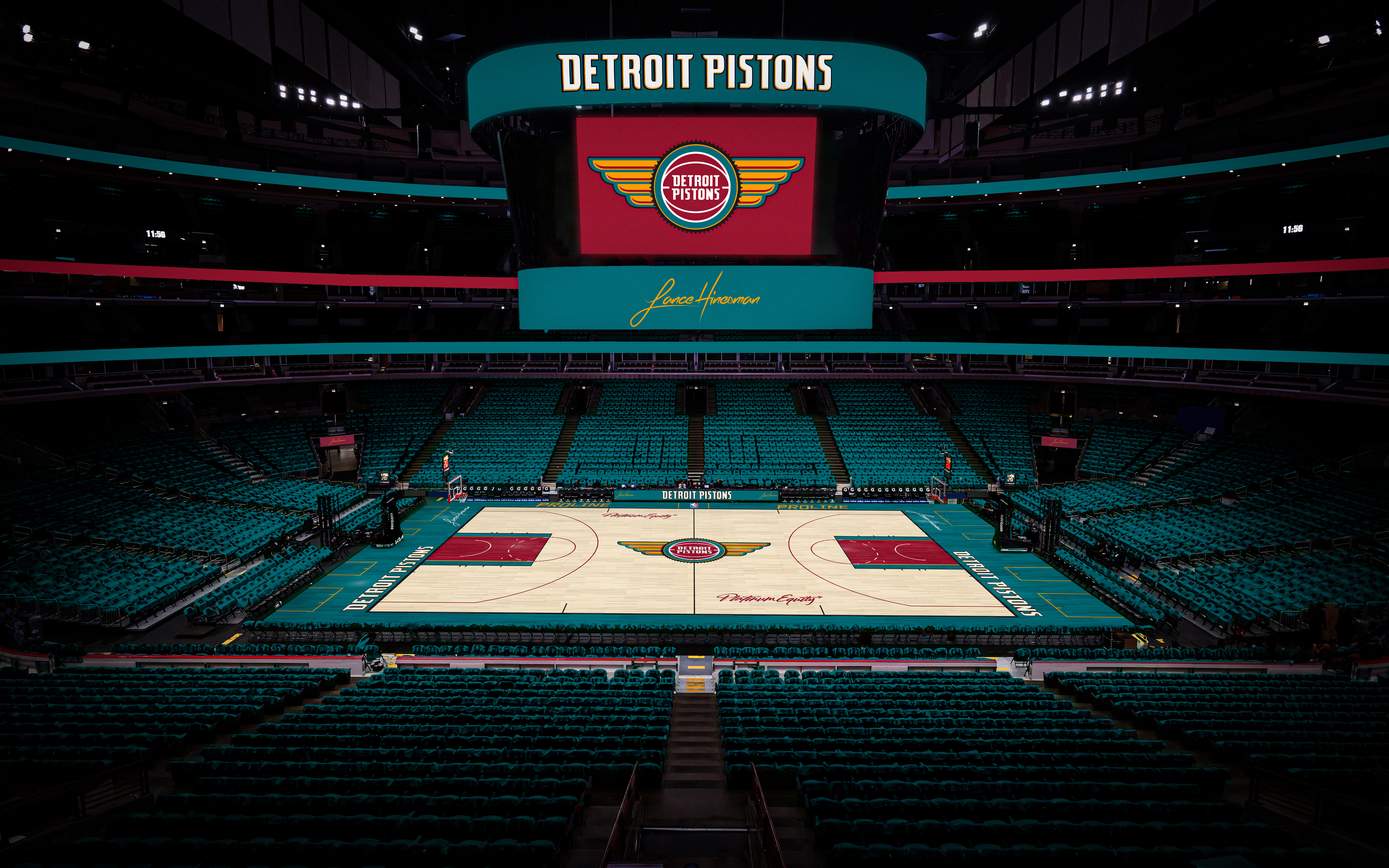
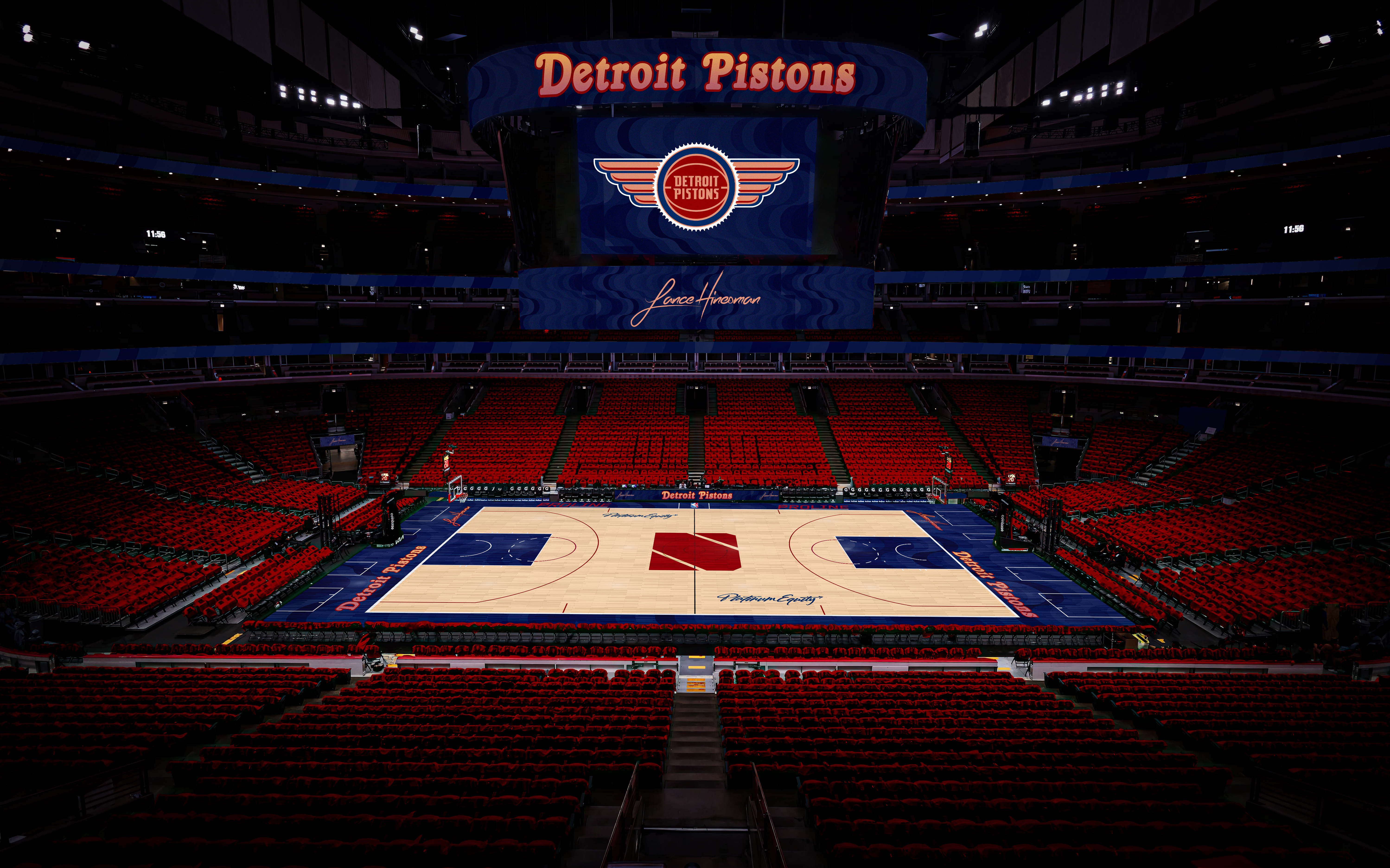
The courts for this redesign are rather simple, letting the new colors and logos take center stage.
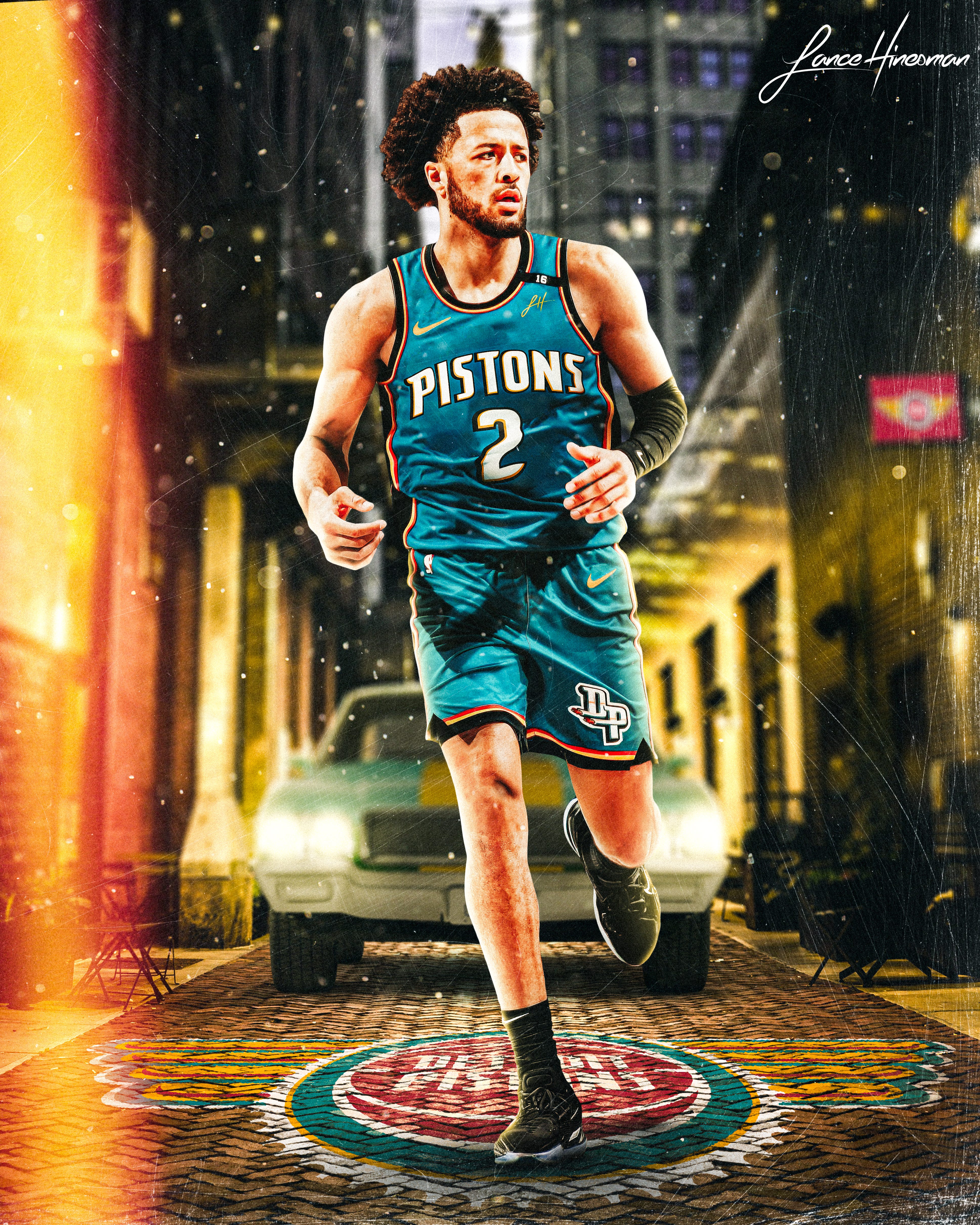
Lastly, Cade Cunningham, the face of the franchise, modeling the Statement Jersey in a Detroit alley.
With Cade Cunningham leading the charge, the Pistons are poised for a new era of success. A refreshed brand, anchored in teal and inspired by Detroit’s culture, could be the perfect complement to their on-court resurgence.