2025 March Madness Sweet 16 Uniform Tier List
Grading the threads of the Sweet 16 Teams still dancing in March Madness
As the next rounds of the men’s March Madness tournament kick off today, I wanted to look at the bracket, not from a analytical perspective, but from a uniform one. Now I love a good tier list, and I decided to best way to look at the uniforms for the sixteen teams would be to organize them into five tiers.
F-Tier: Texas Tech
As a whole, the teams in the Sweet Sixteen don’t have terrible uniform sets, but one team felt a tier below the rest.
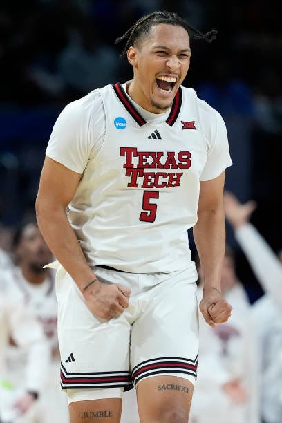
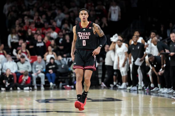
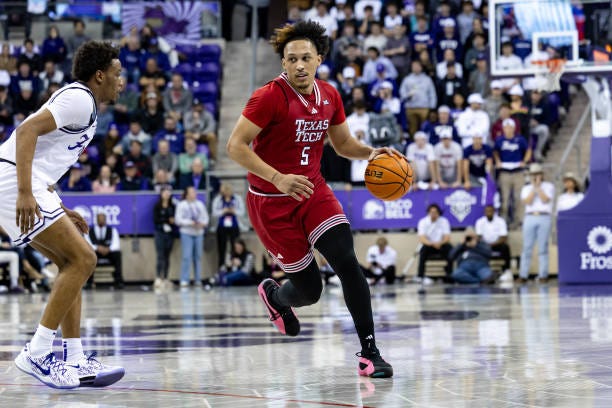

Texas Tech’s main three uniforms are fine on their own—though I don’t love the stacked wordmark across the front. However, The last uniform with just the logo is enough to make it the only F-Tier set.
C-Tier: Alabama, Arizona, Arkansas
The C-Tier teams’ uniforms aren’t bad; they get the job done. But that’s all they do.


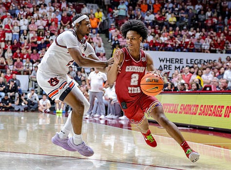
Alabama’s unis largely feel plan, but the ‘Crimson Tide’ alternate stands out from the rest.
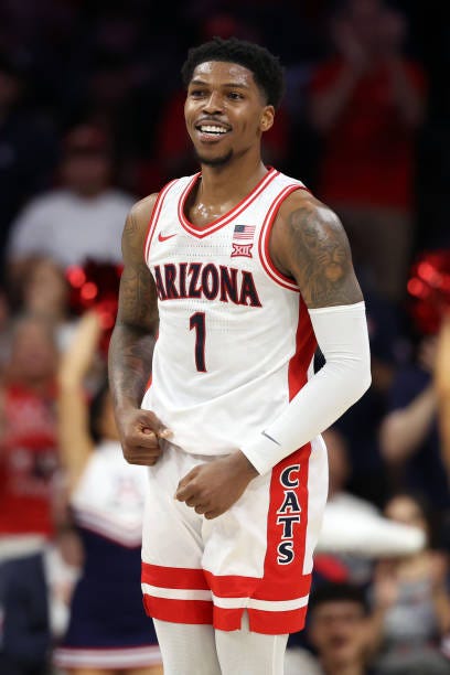
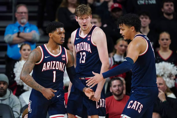
Arizona’s jerseys run into the same problem, but the detailing on the shorts are a nice touch.



The Razorbacks’ unis don’t feel cohesive as set. I’m also not of fan of large logos on jerseys, but they do it much better than Texas Tech.
B-Tier: Auburn, BYU, Kentucky, Michigan
The B-Tier teams step it up a notch, either through colors or creative design choices.

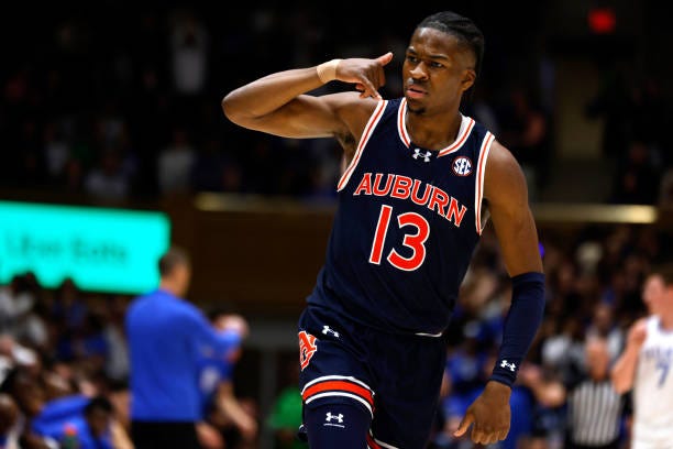
Orange and blue are colors I’ll never grow tired off. Auburn’s navy allows their orange to pop in a way that hits for me.
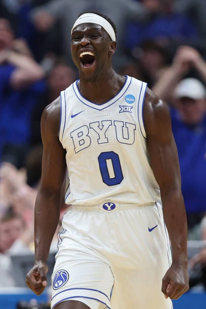
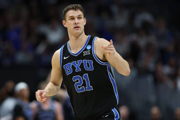

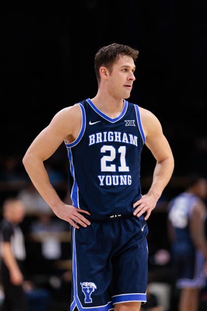
BYU’s white jersey is unique with it’s outline wordmark, but I don’t love the execution. The dark blue jersey stands out as the highlight of the set for me.


Kentucky’s uniforms are classics, yes. But I can’t put them any higher due to their lack of flair or creativity.
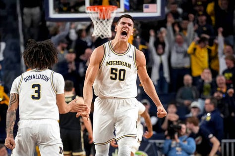
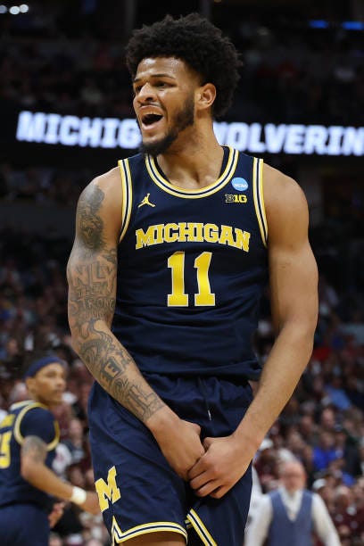
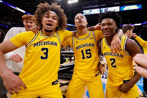
Michigan has a great color scheme, and their yellow shines beautifully across the set. I still would love to see an alternate wordmark or uniform design to move them up a tier.
A-Tier: Duke, Florida, Ole Miss, Purdue, Tennessee
Not quite the best, but great uniforms nonetheless.


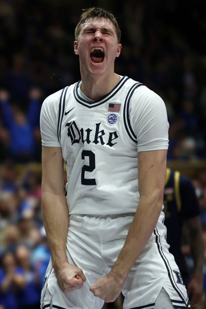
Duke very nearly made S-Tier for me. What kept them out was their best uniform being relegated to an alternate.
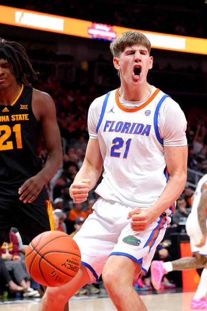

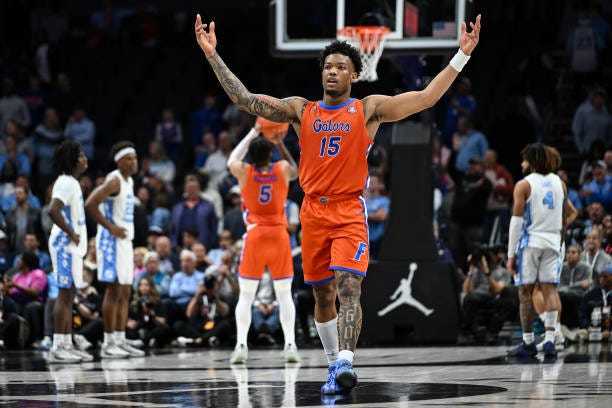
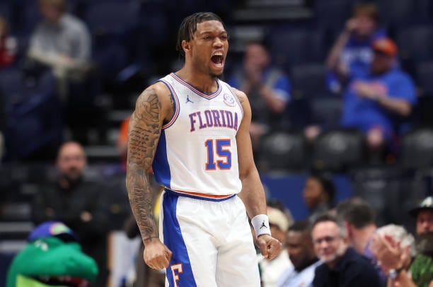
Florida’s another team making use of orange blue, but with a bit more creativity. I really love their wordmarks, and I would only wish that they tie in green into at least one of the uniforms.

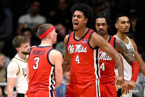
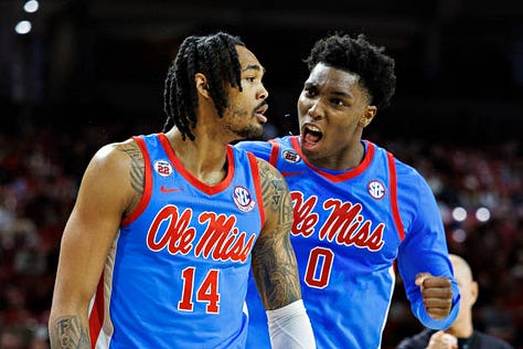
Ole Miss has a great color scheme, and their baby blue pops nicely. There’s not much to nitpick here, I simply feel the teams in the next tier have better sets.

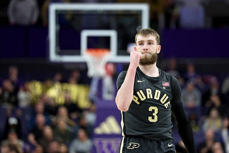
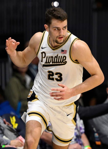
Now gold is my favorite color, leading me to nearly put Purdue in S-Tier. However, I’m not the biggest fan of their standard wordmarks. The cursive one is a gem though.

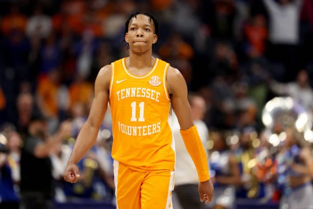


Tennessee’s orange is striking across their entire set. It looks great on their alternates which elevates the set. The black uniform’s lack of detail just barely keeps it out of S-Tier for me though.
S-Tier: Houston, Maryland, Michigan State


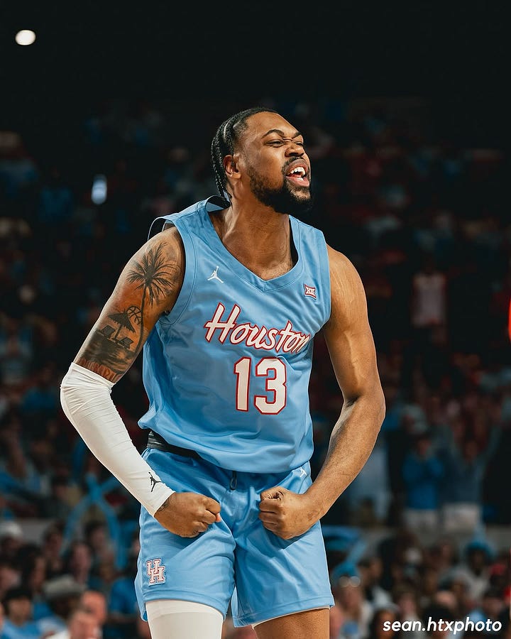
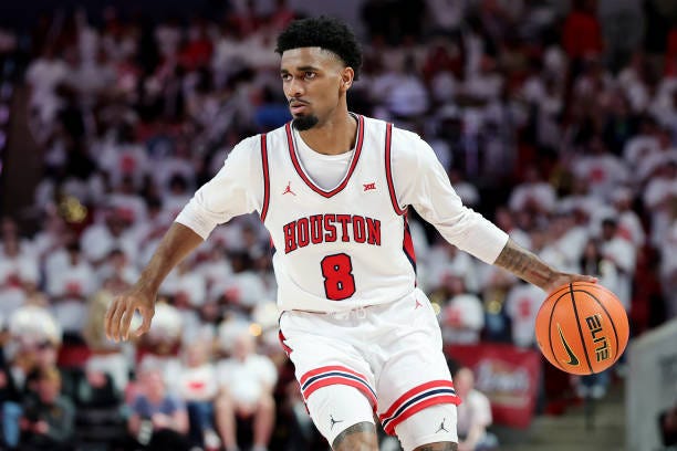
I’m a big fan of Houston’s wordmarks, they nail the baby blue better than Ole Miss in my opinion. The white alternate reminds me a bit too much of the Chicago Bulls though.

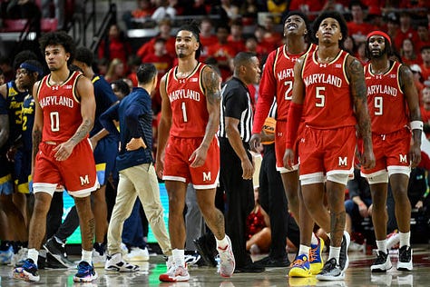
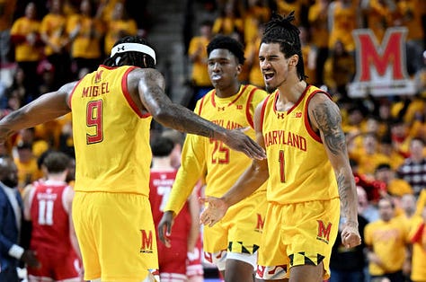
The way Maryland integrates their state flag into their uniforms and colors is perfect. It was hard for me to leave them out of S-Tier.


Michigan State uses the Spartan motif wonderfully add great detail to their uniforms, The alternate wordmark is fantastic as well.
Overall, while every team in the Sweet Sixteen brings something unique to the court, the best uniforms balance tradition, creativity, and bold design choices—elevating them from just jerseys to true statements of school pride.


